I’ve been thinking about the display of data quite a bit lately. Some ways of presenting data are clearly more effective than others. When providing data in a visual format the goals are one of the following:
- Allow fast consumption of large amounts of information.
- Make patterns and trends obvious.
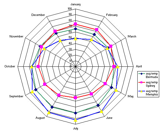
This brings me to the annoying Excel radar chart. File this one under “Just because you can doesn’t mean you should.” I’ve yet to come across a situation where this monstrosity was the best choice. I tried to give it the benefit of the doubt and did a little Googling to see what I came up with. This led me to “Using a radar chart in Excel to see the big picture” which contained the following gem which I think illustrates my point perfectly:
The pattern in this data set is
more clearly revealed using a Radar chart
I hate to be a hater but as a French coworker used to say: “Are you joking me!?!” If this is the “more clearly revealed” version of the data I don’t want to see the previous attempts.
Luckily, the sample data was included so I went ahead an took a shot at recreating the chart using a plain old boring line chart:
Hmm, I’m not sure what the “big picture” was that the original radar chart was showing us but using the line chart it is very quickly obvious that:
- The trend for Sydney is opposite the trend for Bermuda and Memphis.
- The trend for Bermuda and Memphis are similar.
- The curve for Memphis is substantially steeper than Bermuda and Sydney.
In the end it’s apparent a line chart is a substantially better choice for this data and allows the viewer to analyze the data substantially faster than the radar graph.

